Every Number I Didn't Measure Was Wrong
Five claims I wrote into a schema, a README and a set of docs without ever checking them against the real thing. Three were flatly wrong, one was a mechanism I misread twice, and one was true in a way that misled me anyway.
I went to publish something about the database behind my personal health tracker, and fact-checking it took a day. By the end, most of the numbers I had written down to justify that database’s design had turned out to be wrong.
Not wildly wrong. Wrong in the quiet way, where the conclusion still holds and the reasoning under it has rotted. Every single one had the same cause: I measured something adjacent to the thing I cared about, wrote the result into a comment, and then the comment outlived my memory of where the number came from.
The setup, briefly. Ten years of Apple Health data plus two and a half years of lifting, on SQLite until it lost data twice and on TimescaleDB since. 73,210 Reports across 81 metrics in a 30 MB database, and the repo is public. That last part is why this was worth a day of anyone’s time: a wrong number in a public schema comment is a wrong number somebody else might trust.
Five of them, roughly in order of how badly the arithmetic was wrong. The last one is barely wrong at all and is by some distance the one that should worry you.
1. The segment key, wrong twice in opposite directions
TimescaleDB’s columnstore lets you nominate a segmentby column. Rows sharing that value get grouped into a compression batch together, which is where most of the ratio comes from. For a tall, narrow table storing (day, metric, value), metric is the textbook choice, and every guide will tell you so.
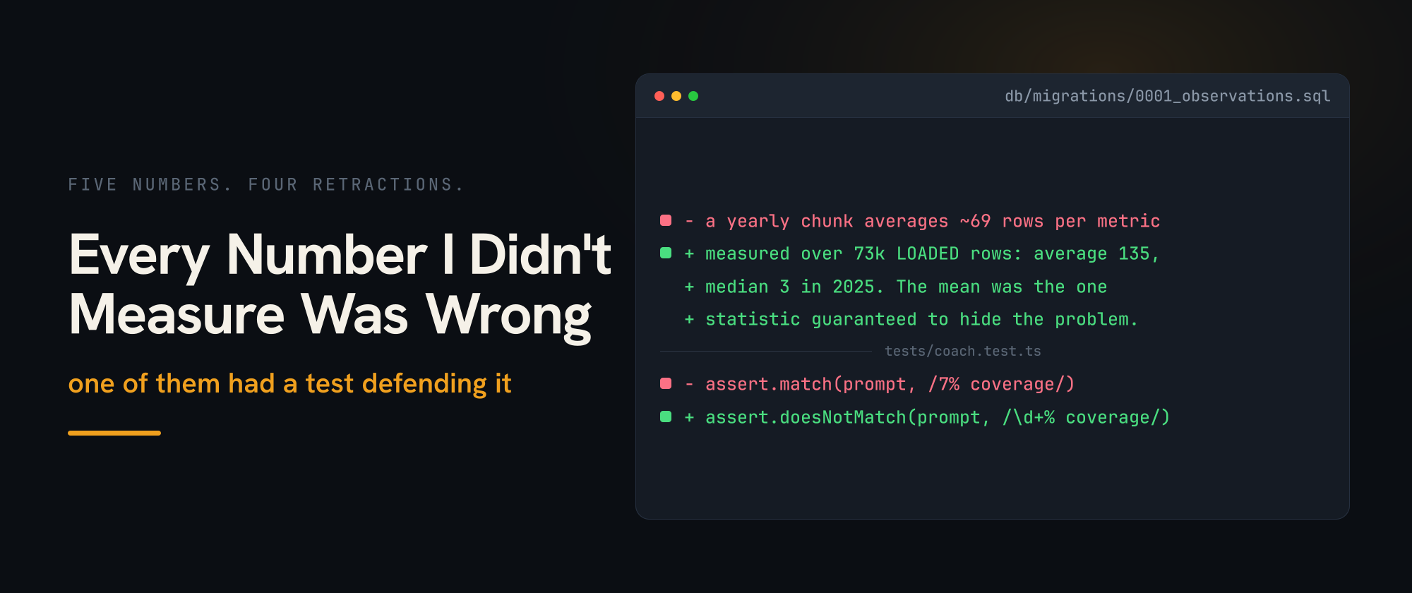
I didn’t use it. My schema comment explained why: roughly 69 rows per metric per yearly chunk, against a rule of thumb that wants more than 100 rows per segment value per chunk. Below the line, so no segmenting. That comment sat there looking authoritative for months.
Re-running it against the actual table:
yr    rows_per_metric
2019  206
2022  197
2020  174
2021  173
2024  153
2023  152
2026  124
2025   93
2018   92
2016   74
2017   48
Average about 135. Seven of eleven years sit above the guideline, not below. My comment was wrong in the direction that reverses the decision.
The cause is stupid and completely mechanical. I computed it from the 56,000 data points in the export files rather than from the rows that landed. The parser fans out: one heart_rate point becomes three metrics, one sleep_analysis point becomes six. 56,000 points went in, 73,000 rows came out, and I’d done arithmetic on the input file.
So I corrected it, felt good for about four minutes, and then looked at the distribution.
yr    metrics  >=100  <100  <20   median
2016  38        9     29    25     10
2017  40        4     36    27      9
2024  81       34     47     6     69
2025  76       23     53    46      3
2026  77       60     17     6    117
The average is dragged up by a handful of metrics that fire every day. Step count has ten years of unbroken coverage. Vitamin D has whatever MacroFactor felt like logging that week. In most years more metrics fall below the threshold than above it, and in 2025 the median metric has three rows.
Right call, wrong reasoning, twice. And I should be straight about how far the correction actually goes: I have never built the segmented version and compared ratios. What I have is a good argument sitting where a measurement ought to be, which is the exact failure this post is about, showing up inside the section where I’m supposedly fixing it.
The transferable bit is smaller than the story. Compute rows-per-segment-value from the loaded table rather than from whatever you fed it, and look at the spread instead of the mean. An average over a skewed distribution is the one statistic guaranteed to hide the shape of your problem.
2. “About a week,” which I appear to have made up
Health Auto Export revises a day after that day has closed. That’s the central fact of this whole system, and how long it keeps revising decides the chunk interval: the revision window has to fit inside the chunk that’s still uncompressed, or a routine correction has to decompress historical data to land.
My schema comment said “about a week.” So did the README. So did two other files.
I never measured it. I picked the figure up somewhere early, it sounded about right, and it hardened into documentation through nothing but repetition across four files.
What the live data says:
days_late  reports  distinct_days
0          1610     6
1          2298     6
2          110      4
3-7        62-69    1 each
Every value change happens at a one-day lag. Nothing at lag two or beyond has changed a value. And that 3-to-7-day tail is a single day, contaminated: it has one hae_backfill row and one live row reported on the same date, which is the migration overlapping itself rather than HealthKit revising anything.
The honest caveat, which matters more than the number: the live pipeline has been running for five days. “No seven-day tail” is weak evidence, not proof. So the position is one day measured, longer assumed, and yearly chunks are absurdly conservative for either.
The decision was never at risk. But “the assumption is safe” and “the assumption is verified” are different claims and I was only ever entitled to one of them. The comments now say which is which, which took ten minutes and should have happened months ago.
3. The watermark, which I diagnosed twice and understood once
The number in this one is INTERVAL '1 hour', and unlike the others it isn’t a measurement I got wrong. It’s a measurement I never took, because I reasoned my way to a value instead and the reasoning was flawed. It’s also the only entry here that reached a user, where user means me, on my phone, in a grocery store.
MacroFactor said I’d eaten 1,556 calories. My own site said 688. Both were reading the same database.
Real-time aggregation unions materialized buckets with raw rows newer than the watermark. It’s a very good feature and it’s why a dashboard doesn’t wait on a refresh job. But once a bucket has been materialized, raw rows for that bucket are never consulted again until something explicitly refreshes it.
Read that sentence again, because I didn’t. “Fresh past the watermark” is not the same promise as “always fresh,” and I had cheerfully substituted the second. A Report landing later the same day never gets looked at again, so the view goes on serving a stale number with total confidence, which it’s entitled to do because I’m the one who configured it that way.
My first fix blamed the backfill, which called refresh_continuous_aggregate(cagg, NULL, NULL) and materialized every bucket including today’s. That was a real cause, so I narrowed the refresh, felt clever, and moved on.
It came back, and there were two things I’d had wrong.
The watermark only moves forward. Refreshing a narrower window afterwards doesn’t walk it back, so today stayed materialized and the only way to clear it was to rebuild the aggregate.
And my refresh policy was doing it too. I’d set end_offset => INTERVAL '1 hour', reasoning that a bucket ending at midnight tonight can’t possibly be older than an hour ago. That reasoning is simply wrong, and the watermark had duly advanced past today.
The fix is belt and braces on purpose. end_offset widened to two days so the current day is never a refresh candidate, and the application reads today straight from the raw log with DISTINCT ON ... ORDER BY reported_at DESC, which computes exactly what last(value, reported_at) computes. Having misjudged the same rule twice, I stopped resting correctness on my ability to reason about it.
For the good version of real-time aggregates rather than my footgun collection, Sven Klemm’s original post is still the clearest explanation of the mechanism, and there’s a troubleshooting page covering this precise class of problem that would have saved me a week. The behavior isn’t a bug. My mental model was.
4. A compression ratio measured against my own test loop
before  after    ratio  chunks
13 MB   1496 kB  8.7    12 (11 compressed)
Eight point seven times, on a database whose entire before state was thirteen megabytes. At this size that’s not a benefit and I won’t dress it up as one. Compression earns its keep when you’re paying to retain hundreds of gigabytes, which is a sentence about somebody else’s database.
It’s worth showing anyway, because the mechanism is legible here in a way it isn’t at scale. Tall, narrow, heavily repeated values in the ordering column. Nothing about that cares how many rows you have.
Two things I got wrong about it.
I measured 11.9x first, locally, and reported it to myself as good news. It was garbage. Re-running an idempotent backfill over and over leaves dead tuples, which inflate the uncompressed “before” without adding any data. I was benchmarking my own test loop and feeling great about it. Measure compression on a freshly loaded table, never on one you’ve been iterating against.
And I wrote a note promising to re-measure once live restatements had accumulated, which turned out to be more interesting than the ratio. I can’t. Every live Restatement lands in the current chunk, chunks are yearly, and the columnstore policy waits 30 days past a chunk’s range. That chunk runs to March 2027, so nothing written since going live compresses until roughly April 2027. The follow-up is eight months out rather than pending, and I only worked that out because I went looking instead of promising.
5. One number that was true and misleading at the same time
CLAUDE.md said sleep had “~7% coverage,” and concluded that sleep was too sparse to build anything on, which is why the app displays sleep without grading it. Perfectly reasonable inference from the number it had.
window     nights  possible  pct
last 365d  23      365        6.3
last 90d   21      90        23.3
last 30d   21      30        70.0
The year figure was right. It was also concealing that 21 of the 23 recorded nights in the entire year are in the last thirty days. Current coverage is 70%. Something about my watch-wearing changed in July and the annual average will take a year to notice.
Nothing here was ever wrong, exactly. One number was doing the work of three, and the guidance built on it (“basically no sleep data”) stopped being true without anything visibly breaking. That’s a worse failure mode than a number that’s simply incorrect, because there’s no moment where it flips.
The pattern, since there is one
Four of these five were caught in a single day, by the same move: run the query against the real artifact instead of trusting the note. None of the queries took more than a minute to write. The expensive part was never the measurement, it was noticing that a measurement was owed.
What they have in common is that a plausible number outlives whatever made it plausible. It gets written down once, in a comment or a doc or a README, in a moment when you have the context to know what it means and what it excludes. Then the context evaporates and the number stays, in the imperative mood, looking like a fact.
And they don’t always sit there passively waiting to be caught. The sleep figure above turned out to have seven copies, one of them in the system prompt of the app’s chat, where it was being read aloud to me as though it were current. When I went to delete that copy, a unit test went red: it asserted the prompt must contain the string “7% coverage.” The wrong number had acquired a defender, and anyone who noticed it before me would have hit the same red test and reasonably concluded they were the ones in error. That’s the version of this failure I’d least like to meet again, because diligence doesn’t save you from it. Diligence is what puts it back.
Three habits came out of this, and I’ve actually adopted them rather than merely resolving to.
The first is to write the method next to the number. Not “~69 rows per metric” but “~69 rows per metric, from the export scan.” That second version carries its own bug report, visible to anyone who reads it including me six months later. The first version is where I lost months.
The second is to say, in the artifact itself, which side of measured-versus-assumed a figure sits on. My chunk-interval comment now has MEASURED and ASSUMED in capitals, which looks a bit much and has already stopped me re-quoting a guess as a finding twice.
The third is to distrust any single number describing a distribution. Both of my segment-key figures were averages and both were wrong, in opposite directions, because a skewed distribution has no meaningful average. The sleep figure failed identically, except across time rather than across metrics.
It’s the engineering equivalent of labelling your leftovers, and the only reason it’s worth a post is that I’d have told you I already did all three, right up until the afternoon I checked.
Companion pieces: The past keeps changing is the argument this project exists to make, about data that revises itself and why upsert makes that unfalsifiable. Don’t give the model SQL is about the app on top of it.